iOS e-commerce App Development
Approach
An excellence in designing and developing strategy loaded with creativity and technology for IOS Application Development.
High value digital solutions are provided for the clients to drive their business growth.
A team of iOS developers with vast superiority in developing innovative, hassle-free and user-friendly iOS Applications that promotes and automates business prolifically.
A well experienced team of designers to mark each and every prerequisite of a client and delivering a stunning IOS app design
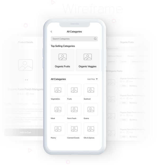
Wireframe planning sets the business apart from others right from the preliminary stages of development.Get a scalable UX architecture through wireframes from webnexs.
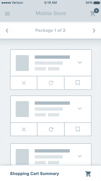
Prototypes always convey the outcome of the business much quicker and puts the businesses to decide on the changes it has to make helping them to stand apart from the crowd.
Creating highly individualized app with development team bringing the prototypes to real life usage through the right technologies.
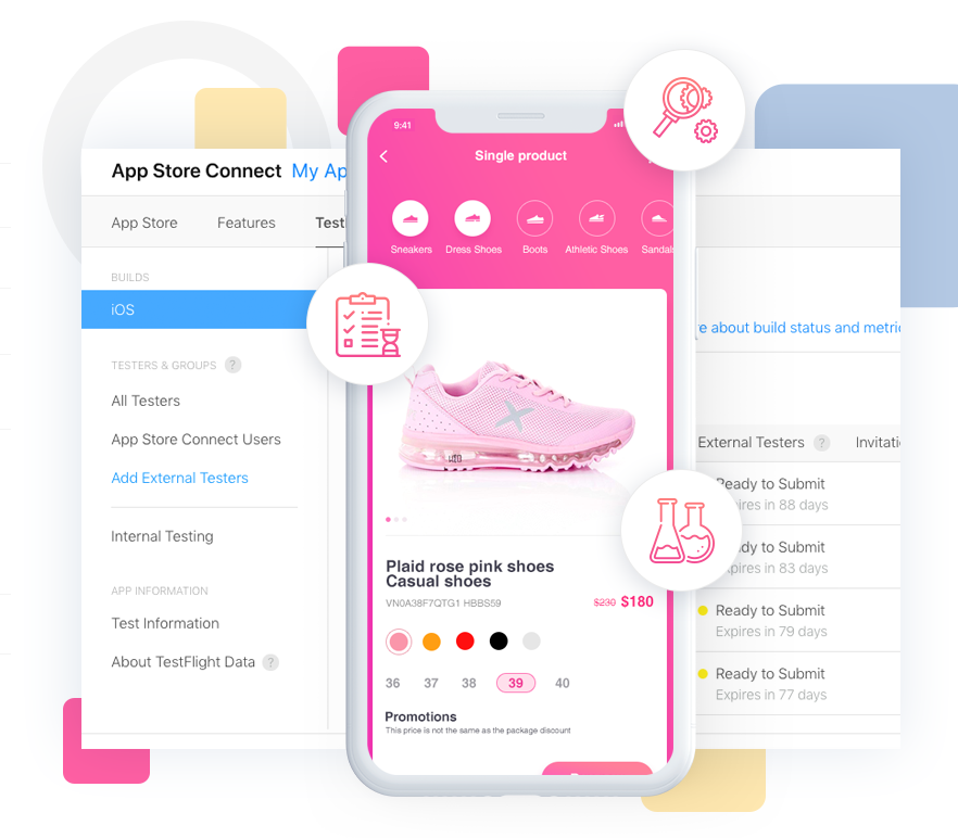
QA team is well set with testing tool which contains XCode testing framework and follow superlative practice that assist to progress the narration of your application and debug all the possible issues.
When the product is ready, deploy it on the App Store as per requirement and craft a strategic plan on further updates and provide full support and maintenance for bugs, new changes.
Get best value from experienced developers for the app that customers would love to navigate upon. We develop apps and maintain them to create marked up impression on user base.


Our Forte
-

Enterprise Mobility
Solution -

Customized
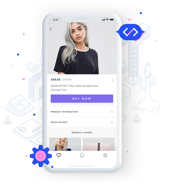
Ecommerce Solution -

Multi-Vendors
Retail App -

iOS
Microservices -

AR & VR Technology
Based Apps -

Sales Management
System -

Retail BOT
Development
We get you Remarkable
-

Delivering Robust &
Scalable AppsWell scalable and high-end IOS app Development ensures client engagement and employee management.
-

Build safe
ApplicationsDevelopers are expert in the encryption processes which ensures safe and secured application.
-

Exceptional
SuperiorityA well trained developer with development tools to land up with the predictable on the quality standards for IOS app structure.
-

Result-oriented
StrategiesCoherent techniques help address the iOS app development needs effortlessly.
-

Outsourcing Services
with 24/7 availabilityClient will be assisted with sheer expertise till they are satisfied with their desired outcome.
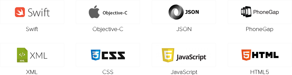
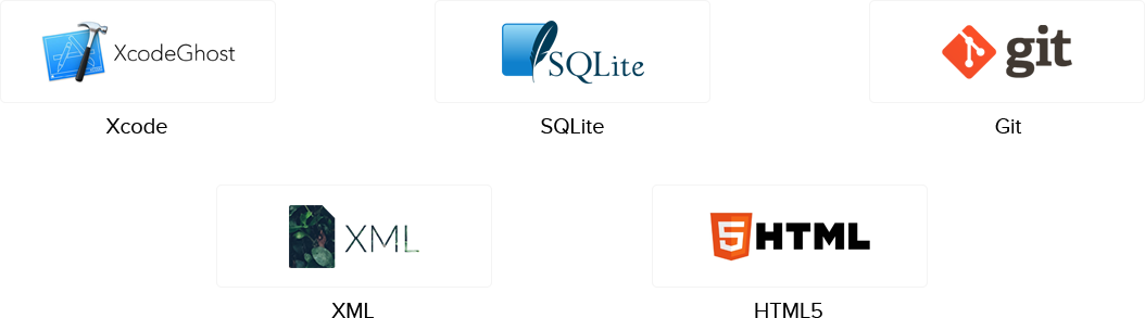
Technologies Stack
iOS Blog
9 Essential iOS 11 Features to Consider for your App
Nowadays Apple is releasing peer-to-peer transactions with Apple Pay, a redesigned App ... Read More
10 Things to Know Before You Hire an iOS Developer
The stats are adequate to the reason why businesses are eager to get mobile apps built ... Read More

Important Steps to turn your idea in to reality with iOS app
Millions of Apple users scan the iOS App Store every day in search of new and diverse ... Read More